Case study
Redesigning Equifax's Statutory Credit Report landing page to reduce cognitive load, align with regulatory obligations, and create an…
Date
Reading time
4 min read
- Fintech
- UX Design
- CRO
- Design Systems
- Accessibility
Executive summary
Under UK financial regulations governed by the Financial Conduct Authority (FCA), consumers hold a legal right to access their statutory credit record free of charge. Equifax's legacy landing page suffered from dense regulatory prose, broken visual hierarchy, and friction-heavy verification entry routes that damaged onboarding completion and eroded consumer trust. Acting as CRO & UX Design Manager, I conducted an in-depth heuristic evaluation, mapped drop-off triggers, and architected an accessible redesign proposal. By surfacing an onboarding card above the fold, demystifying required identity documentation into scannable steps, aligning components with Equifax's design system, and ensuring strict WCAG 2.1 AA accessibility standards, I transformed a mandatory compliance obligation into a clean, frictionless, and transparent customer acquisition touchpoint.
Project overview
- Company: Equifax UK
- Domain: Fintech / Consumer Credit Services
- Core skills demonstrated: Usability evaluation, Conversion Rate Optimisation (CRO), UI/UX design, regulatory compliance design, visual hierarchy, design systems, front-end architecture
What this project proves about me: I turn complex, highly regulated financial requirements into clean, high-converting digital interfaces that balance consumer rights with commercial user experience standards.
The challenge
Under UK statutory obligations governed by the Financial Conduct Authority (FCA) and data protection legislation, credit reference agencies must provide citizens with free access to their statutory credit record.
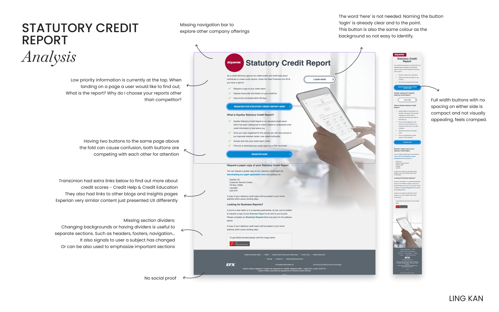
Equifax's existing statutory credit report landing page faced several UX and commercial hurdles:
- Severe cognitive overload: The legacy layout was text-heavy, packed with legal caveats, and lacked structured content hierarchy, causing immediate drop-offs.
- Ambiguous signposting: Consumers struggled to understand the distinction between a one-off Statutory Credit Report and subscription-based credit monitoring packages, leading to friction and support inquiries.
- Friction-heavy onboarding: The initial conversion trigger was buried below the fold, forcing users through multiple disconnected screens before collecting basic verification details.
- Brand misalignment: The visual design had fallen out of sync with modern Equifax digital brand standards, reducing trust at a crucial moment of personal data exchange.
My process
I structured the redesign proposal across four iterative stages:
- Heuristic Evaluation & Gap Analysis: Audited the existing landing page against Nielsen Norman usability heuristics, pinpointing accessibility gaps, cognitive friction points, and form inefficiencies across both desktop and mobile viewports.
- Information Architecture & Wireframing: Restructured the content narrative to clearly communicate eligibility, report contents, and data security up front, followed by low-fidelity wireframes exploring optimal card layouts and form groupings.
- Component Design & Prototyping: Built interactive high-fidelity components in Figma incorporating Equifax's primary colour tokens, accessible typography scales, and responsive grid layouts.
- Executive Presentation & Feasibility Review: Documented the UX rationale into a stakeholder slide deck alongside interactive Figma prototypes, detailing how the proposed UI translates cleanly into modular front-end code for the engineering delivery team.
What I did
I led the UX audit, strategic design proposal, and interactive prototyping for the Statutory Credit Report landing page overhaul.
Strategic presentation
I compiled my research, structural diagnosis, and proposed product narrative into an executive walkthrough to align legal, compliance, marketing and product leadership:
Layout redesign and component architecture
Using Figma, I redesigned the page framework from the ground up, establishing clear separation between information architecture, security reassurance, and actionable user inputs:
Key changes included:
- Persistent above-the-fold conversion card: Integrated key introductory fields and an unmistakable primary Call to Action (CTA) right in the hero section to capture high-intent visitors immediately.
- Demystified legal prerequisites: Replaced dense prose with an iconography-supported three-step breakdown explaining what users need before applying (proof of identity, previous addresses, payment card for identity check).
- Trust signals & security cues: Embedded explicit 256-bit encryption and FCA compliance reassurance badges beside actionable form controls.
- Modular front-end readiness: Structured components around semantic HTML5 sections and reusable CSS grid patterns, ensuring seamless implementation by engineering teams.
Why I made these decisions
- Direct CTA integration in hero viewport: Moving the initial verification entry point above the fold significantly decreases bounce rate by providing immediate momentum for high-intent visitors rather than requiring deep vertical scrolling.
- Transparent expectation setting: Statutory reports require identity verification that can frustrate users if unexpected. Highlighting verification requirements in scannable steps prior to form initiation minimises mid-funnel abandonment.
- Distinct product differentiation: Clear comparison callouts prevented consumer confusion between the free statutory report and ongoing credit score products, reducing regulatory risk and consumer misdirection.
- Accessibility-first contrast tokens (WCAG 2.1 AA): Adjusted button contrast, form label hierarchy, and focus states to ensure statutory access was genuinely barrier-free for all UK citizens across diverse assistive technologies.
Images in context
To visualise the end-state experience, I prepared desktop mock-ups that balanced corporate authority with clean consumer-tech aesthetics.
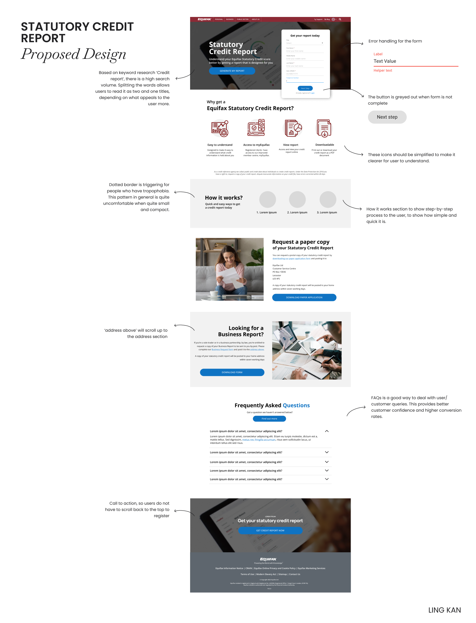
The high-fidelity layout above illustrates the synthesized page architecture. By staging the primary application form within the hero alongside transparent identity verification requirements, reassurance trust badges, and an accordion-driven FAQ section, the experience addresses legal obligations without sacrificing conversion velocity.
Impact / results
While this initiative was delivered as a strategic design and CRO proposal for executive sign-off, it established key benchmark improvements across the consumer journey:
| Focus Area | Legacy Baseline | Proposed Redesign Standard |
|---|---|---|
| Hero Engagement | Primary CTA buried below text-heavy disclosures | Interactive form & primary CTA positioned above the fold |
| Prerequisite Clarity | Unstructured legal disclaimers causing verification drop-off | 3-step visual checklist detailing ID, address history & payment card rules |
| Accessibility Compliance | Inconsistent contrast and legacy form field labeling | Full WCAG 2.1 AA compliant color tokens, semantic inputs, and focus states |
| Product Differentiation | Frequent misdirection between free statutory & paid tiers | Explicit structural demarcation protecting compliance and customer trust |
| Implementation Velocity | Bespoke legacy templates with high maintenance costs | Modular, design-system-aligned Figma components ready for semantic HTML5/CSS3 |
Tools and skills applied
| Category | Tools / skills |
|---|---|
| Design & Prototyping | Figma, Adobe XD, Wireframing, High-fidelity UI, Design Systems |
| Research & Strategy | Heuristic Evaluation, Conversion Rate Optimisation (CRO), User Journey Mapping |
| Technical & Delivery | Semantic HTML5, CSS3 Grid/Flexbox, Accessibility (WCAG 2.1 AA) |
| Domain Knowledge | Fintech, Regulatory Compliance (FCA), Consumer Onboarding |
Roles performed on this project
- UX Design Lead: Audited user flows, dismantled cognitive bottlenecks, and structured modern information architecture.
- UI Designer: Built component systems, interactive prototypes, and conversion-focused layouts aligned with corporate brand guidelines.
- CRO Strategist: Identified drop-off points across the legacy journey and restructured above-the-fold real estate to maximize completion rates.